The Problem:
GigMasters is a 2-sided online marketplace with a member app that is seeing low adoption and perceived usability issues. How can we determine where to focus improvements? What are pain-points and desired feature requests that will improve usability and increase adoption?
Tactics:
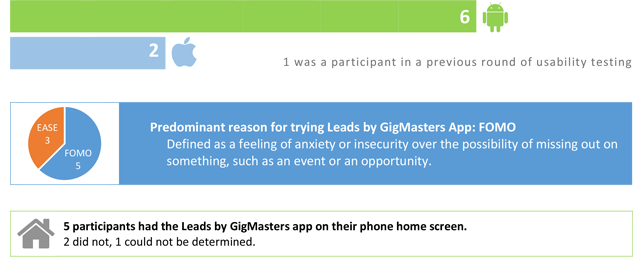
- A screener survey was created and sent to current members who use the app to determine current sentiment towards the Leads by GigMasters app and device adoption, and identify a potential pool of users to invite to participate in the following interview phase.
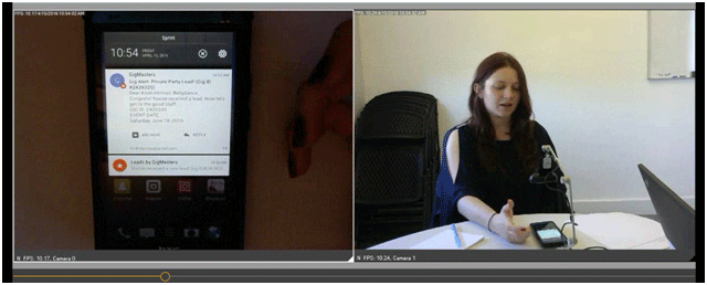
- Conduct live recorded usability interviews with members using the app and services (see example script).
Findings:
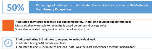
- 3 participants were unaware they could supply a quote via the Leads by GigMasters app – they would manually navigate to the lead using the desktop site or mobile website instead. This was very surprising since this is the main interaction available to members using the app.
- Lead status icons are not fully intuitive to members (see examples of existing icons and definitions). Many were confused by more than one status icon during their session.
- Discoverability of “efficiency features” (ie: dial from quote, open event location in map app, etc.) offered in the Lead Details and Quote form could be improved.
- Alert and display of leads that have information updated by clients should be improved. Some members indicated wanting to filter the inbox to see new leads only and/or leads that have new updates to review – this would allow them to respond faster and and with better information, or know not to respond if it isn’t needed. If a lead has updates, they also indicated frustration at there being no way to easily determine which exact details were updated.
- Many participants indicated a desire to “close the loop” via the Leads by GigMasters app: members indicated wanting the ability to converse with clients and eventually book via the app, both are currently features of the website member sites but not the Leads app.
- Some participants indicated a desire to improve the app notifications. Members would like to be able to customize the sound, click the notification to open the related specific lead (rather than open the app to its last state, as it does currently), and have better information displayed within them akin to high-level information included in email alert summaries. See example showing comparison of an email notification with an app notification for the same lead.
View “How Its Used” Usability Video
View “In Their Own Words” Usability Video
Results:
- Results were used to inform and prioritize feature improvements and updates to member application.
- Low-hanging fruit was fast-tracked, such as icon improvements and the efficiency features mentioned above.